
5 points to make your website device friendly
Faisal / Wordpress
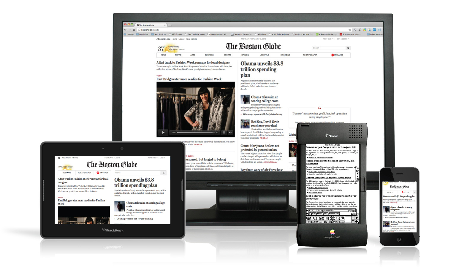
A good looking website should not only be beautiful looking in a large desktop monitor , but also on each device it’s opened on.
We have all sort of devices with different screen sizes which are capable of opening a browser which shows your website.
Imagine your site only looks good on a desktop screen, and breaks in design when viewed from a mobile / tablet device. That can be frustrating, as it can impact your website impressions and perception of your audience.
So how do we fix that ?
Welcome to a design revolution which has managed to make your site look every bit pretty and adjusted on any device.
5 Points to get your website mobile friendly.
- Probably the easiest way to make your site device friendly, is to hook up your site with twitter bootstrap. Find out detailed info here.
- If you don’t want to use an external library as twitter bootstrap, then you can simply use (@media queries ) tags on your header file.
- Adjust your css file by editing it into parts like screen size variance css.
- Use mixins for better update of your file for future use as well.
- Test everything out with a tool call quirktools, which will let you virtualize any mobile device or screen size.